Checklist format
Collection signals that make buying easier
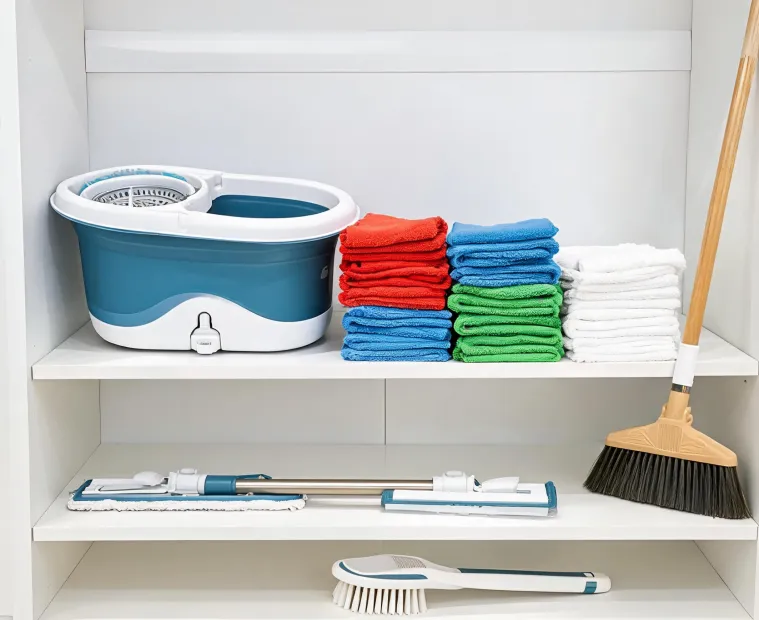
Good cleaning design is easy to recognize before someone reads every package panel. The cues below help users see what a tool does, how it stores, which refill it needs, and whether it fits the room they are trying to reset.
- Color-coded system family: use consistent accents across bucket, mop head, packaging, and refill callouts.
- Refill shape shown clearly: make the connection point visible so shoppers can recognize the replacement later.
- Room-first photography: show kitchen, bath, hardwood, entry, and utility closet use instead of isolated tool silhouettes only.
- Wash guidance close to the product: connect microfiber care directions with the product, not only with support pages.
- Storage posture: show how the system hangs, nests, stands, or slides into a small closet after use.